Repository navigation
feat(ui-pill): new Pill v3 implementation - #2727
Draft
git-nandor wants to merge 5 commits into
Draft
git-nandor wants to merge 5 commits into
git-nandor wants to merge 5 commits into
Conversation


git-nandor
force-pushed
the
INSTUI-5179_new_pill_v3
branch
from
September 23, 2026 14:37
a3f4543 to
97644d8
Compare


Co-Authored-By: Claude <noreply@anthropic.com>
Co-Authored-By: Claude <noreply@anthropic.com>
Co-Authored-By: Claude <noreply@anthropic.com>
Add the missing statusLabel and renderIcon to allowedProps.

Co-Authored-By: Claude <noreply@anthropic.com>
Add a size prop (x-small, small, medium, large) and the accent colors stone, sky, orange,
aurora, plum, violet and sea. InstUI icons in renderIcon are sized to match the Pill.

BREAKING CHANGE: Pill from /latest renders the redesigned v3 styles.

Co-Authored-By: Claude <noreply@anthropic.com>
git-nandor
force-pushed
the
INSTUI-5179_new_pill_v3
branch
from
October 5, 2026 14:50
97644d8 to
a33a3c4
Compare

Contributor
|
Contributor
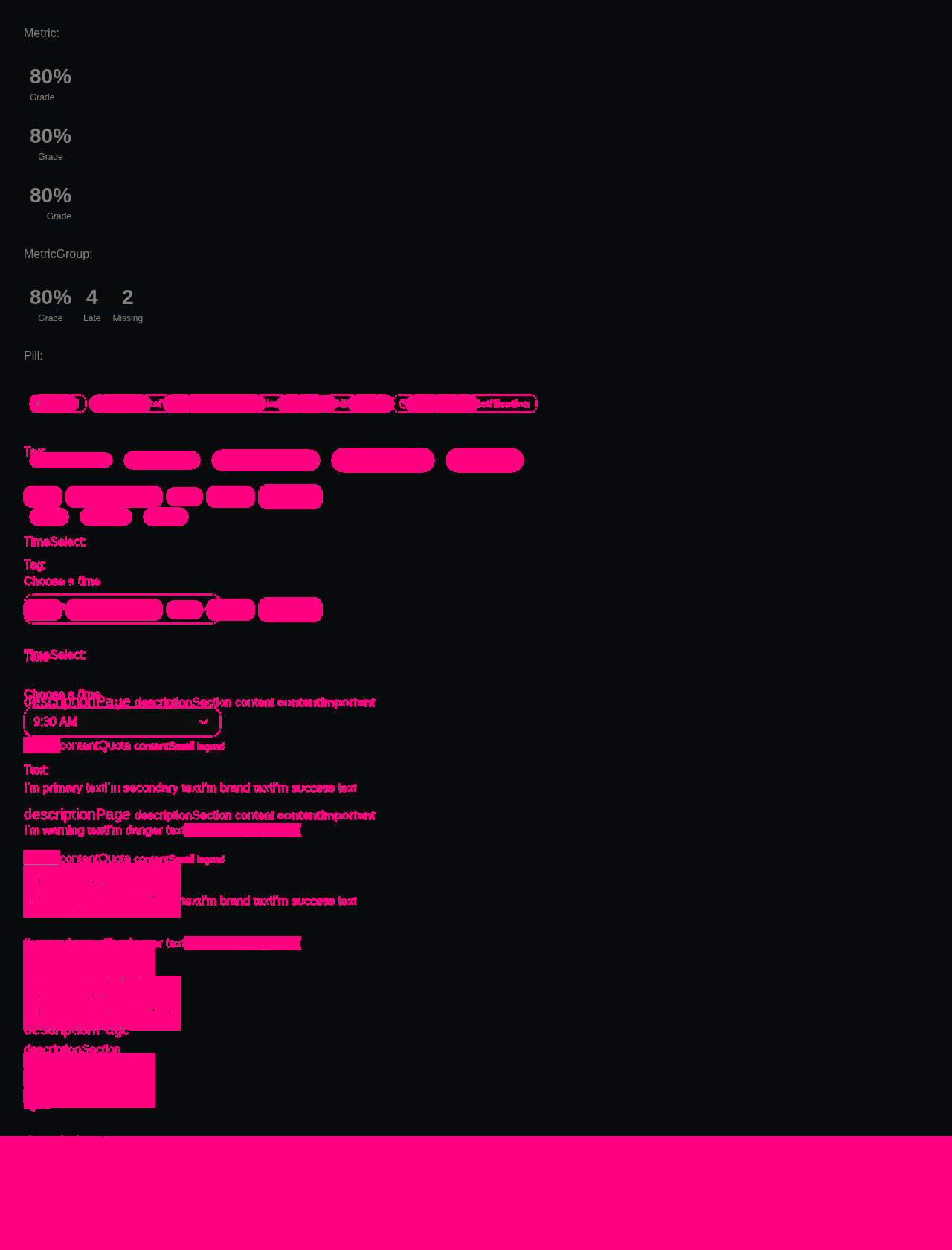
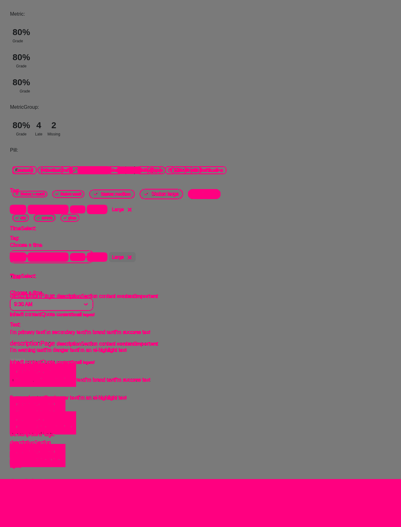
Visual regression reportCypress suite: ✅ Passing Visual diff:
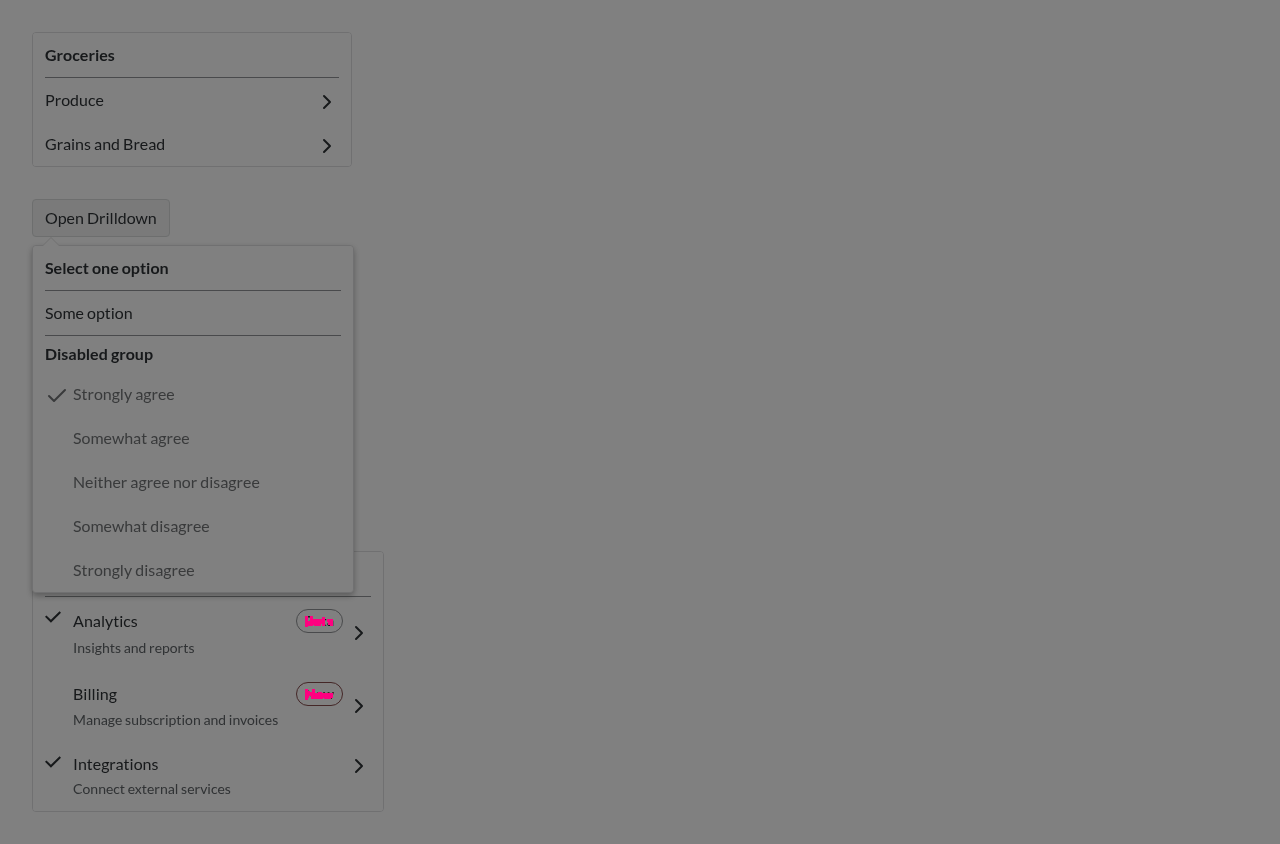
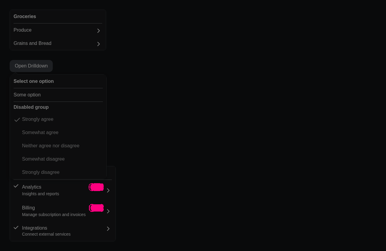
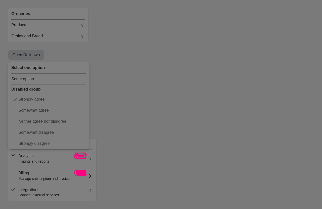
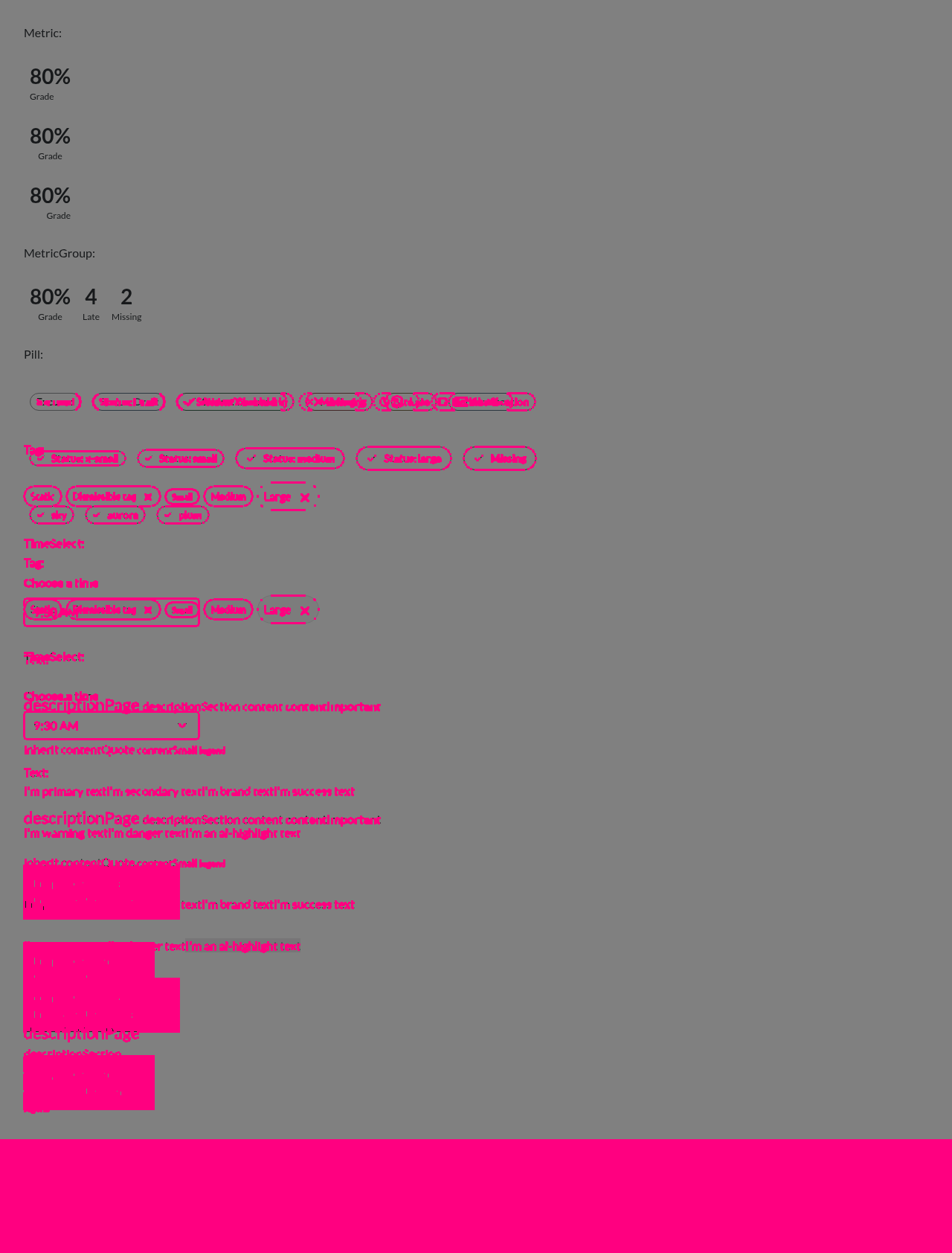
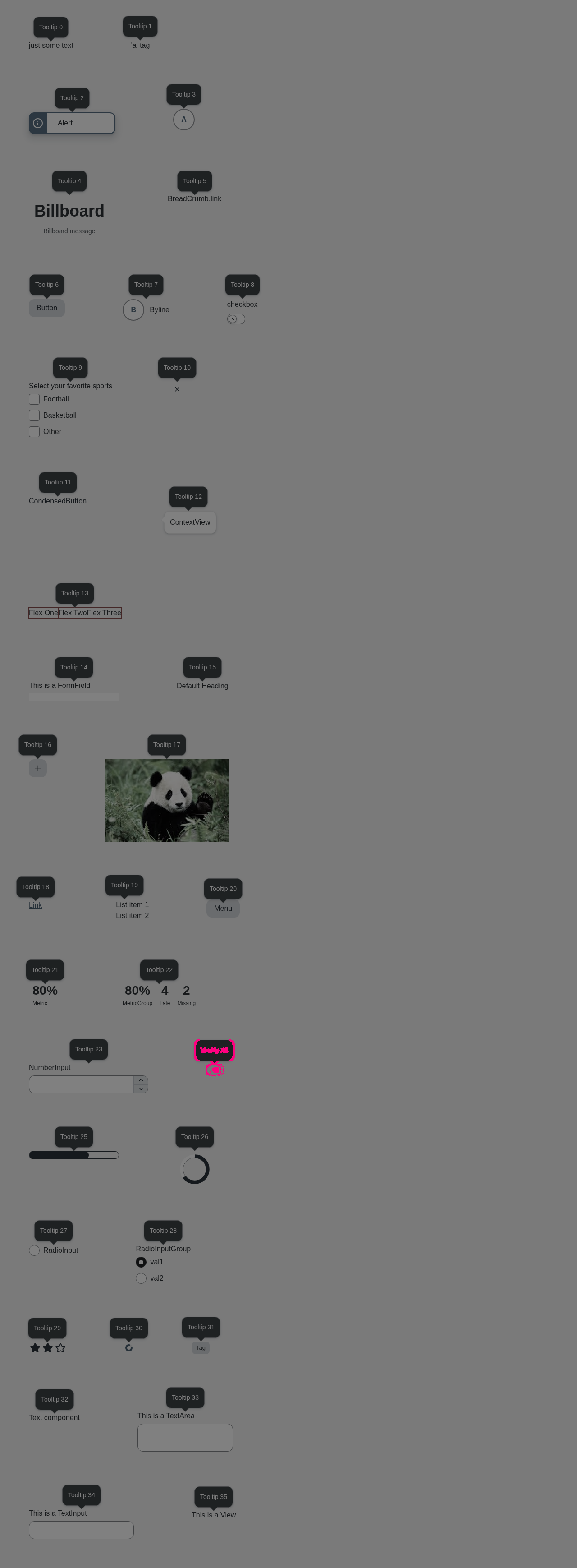
Accessibility (axe): ✅ No violations. 📊 View full report — click a screenshot's ⚠ badge to see each violation boxed on the image, with the offending element named and contrast failures shown as color swatches. Diff images (13)badge-canvas.png — 1573 pixels differcolorpicker-canvas.png — 316 pixels differcolorpicker-dark.png — 5194 pixels differcolorpicker-light.png — 4906 pixels differdrilldown-canvas.png — 130 pixels differdrilldown-dark.png — 1572 pixels differdrilldown-light.png — 989 pixels differsmall-components-canvas.png — 251970 pixels differsmall-components-dark.png — 298425 pixels differsmall-components-light.png — 271025 pixels differtooltip-canvas.png — 65 pixels differtooltip-dark.png — 1208 pixels differtooltip-light.png — 830 pixels differBaselines come from the |
This branch has not been deployed
This file contains hidden or bidirectional Unicode text that may be interpreted or compiled differently than what appears below. To review, open the file in an editor that reveals hidden Unicode characters.
Learn more about bidirectional Unicode characters
Sign up for free
to join this conversation on GitHub.
Already have an account?
Sign in to comment
1 participant

Add this suggestion to a batch that can be applied as a single commit.This suggestion is invalid because no changes were made to the code.Suggestions cannot be applied while the pull request is closed.Suggestions cannot be applied while viewing a subset of changes.Only one suggestion per line can be applied in a batch.Add this suggestion to a batch that can be applied as a single commit.Applying suggestions on deleted lines is not supported.You must change the existing code in this line in order to create a valid suggestion.Outdated suggestions cannot be applied.This suggestion has been applied or marked resolved.Suggestions cannot be applied from pending reviews.Suggestions cannot be applied on multi-line comments.Suggestions cannot be applied while the pull request is queued to merge.Suggestion cannot be applied right now. Please check back later.
Summary
/v11_7, design tokens v1) and a new v3 (/v11_8,/latest), wired into the umbrella and the docs version mapuseStyleNew)sizeprop (x-small,small,medium,large), accent colors (stone,sky,orange,aurora,plum,violet,sea), pastel backgrounds and alpha borders in rebrand, auto-sizedrenderIconMerge notes
git mv v2 v3, sogit blameon v3 keeps the Pill history. Squashing would lose it.packages/ui/src/v11_8.tsand editpackages/ui/package.jsonandpackages/__docs__/versioned-components.ts. Whichever merges later keepsv11_8.tsand changes only its own component's lines to/v11_8.Test Plan
/v11_8/Pill: check the Sizes and Colors examples in canvas, canvas-high-contrast, light and dark against Figma (rebrand: pastel backgrounds, solid error with white text and icon; legacy: white background, colored border, bold text)/v11_7/Pillstill renders the old Pillsmall-components: new size row and accent colorsFixes INSTUI-5179
🤖 Generated with Claude Code